PROJECT 002
01 FEB 2024
MY ROLE: UX DESIGN ・UI DESIGN ・BRANDING
Cetra.
Connecting healthcare from clinic to home.
Introduction
Cetra approached us with the vision to revolutionise the way medical documents are shared among practitioners and patients. The goal was to develop a user-friendly app that would facilitate the efficient management, exploration, and sharing of curated medical documents, ensuring a seamless experience for a primary user group of medical experts.
Challenge
The main challenge was to create an intuitive platform that could handle complex medical data and present it in a manner that was easy to navigate without sacrificing depth. The medical field's stringent requirements for accuracy and ease of access meant that the solution had to be both innovative and reliable.
Design Process
1. WEB & APP DEVELOPMENT:
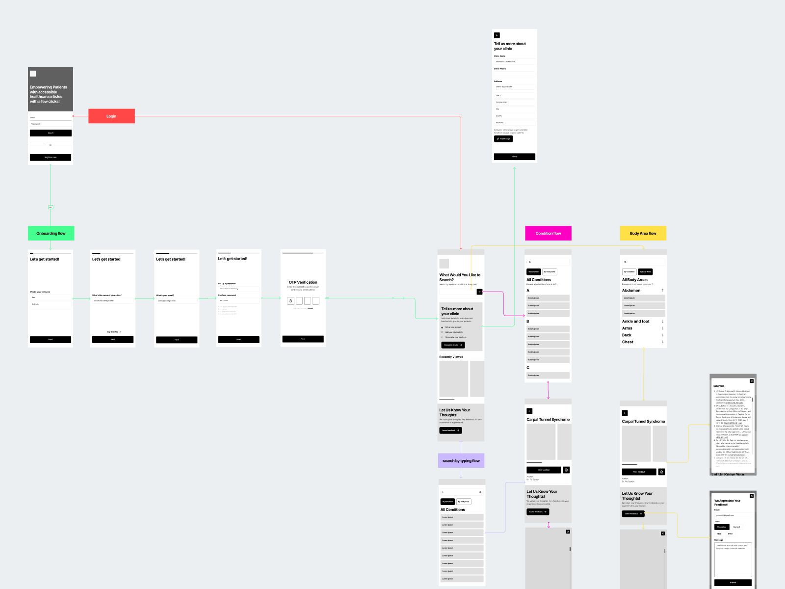
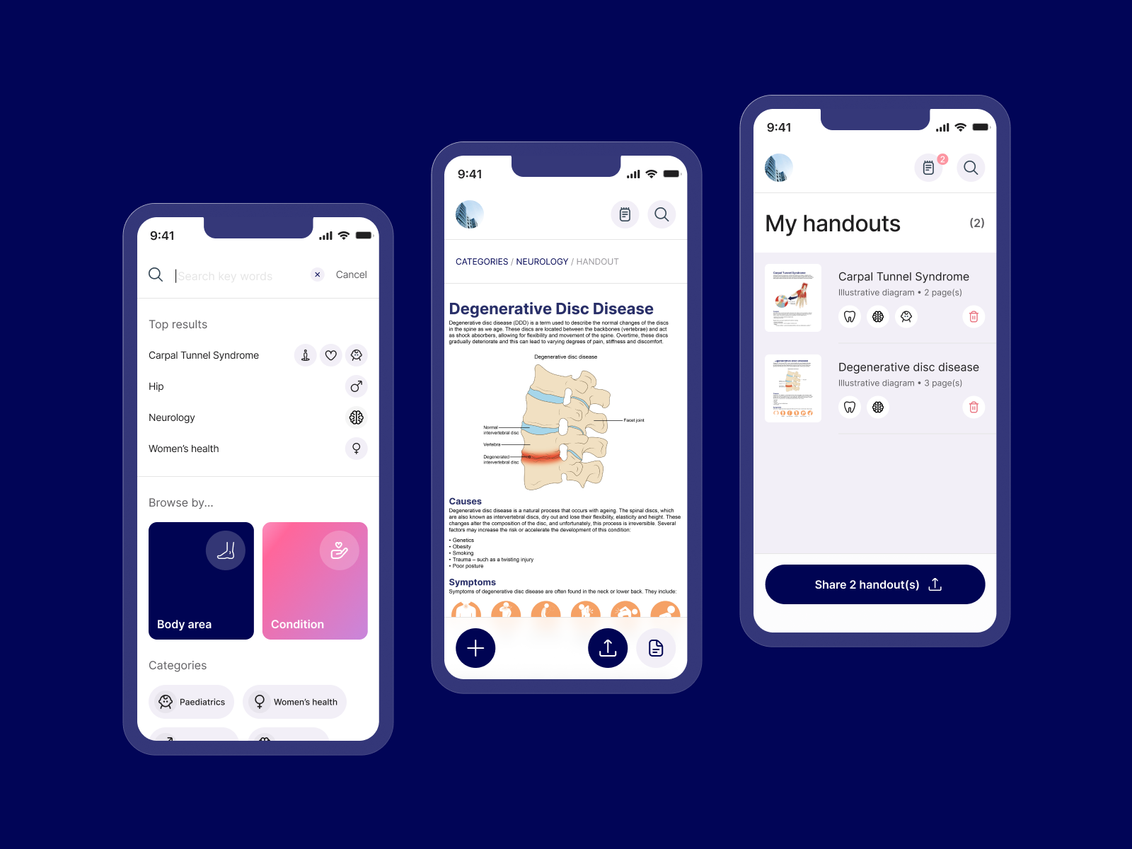
User Experience Design: We started by mapping out user flow diagrams to visualise the most streamlined paths for various user interactions. This was crucial for ensuring that both doctors and patients could achieve their objectives swiftly without confusion or delay.
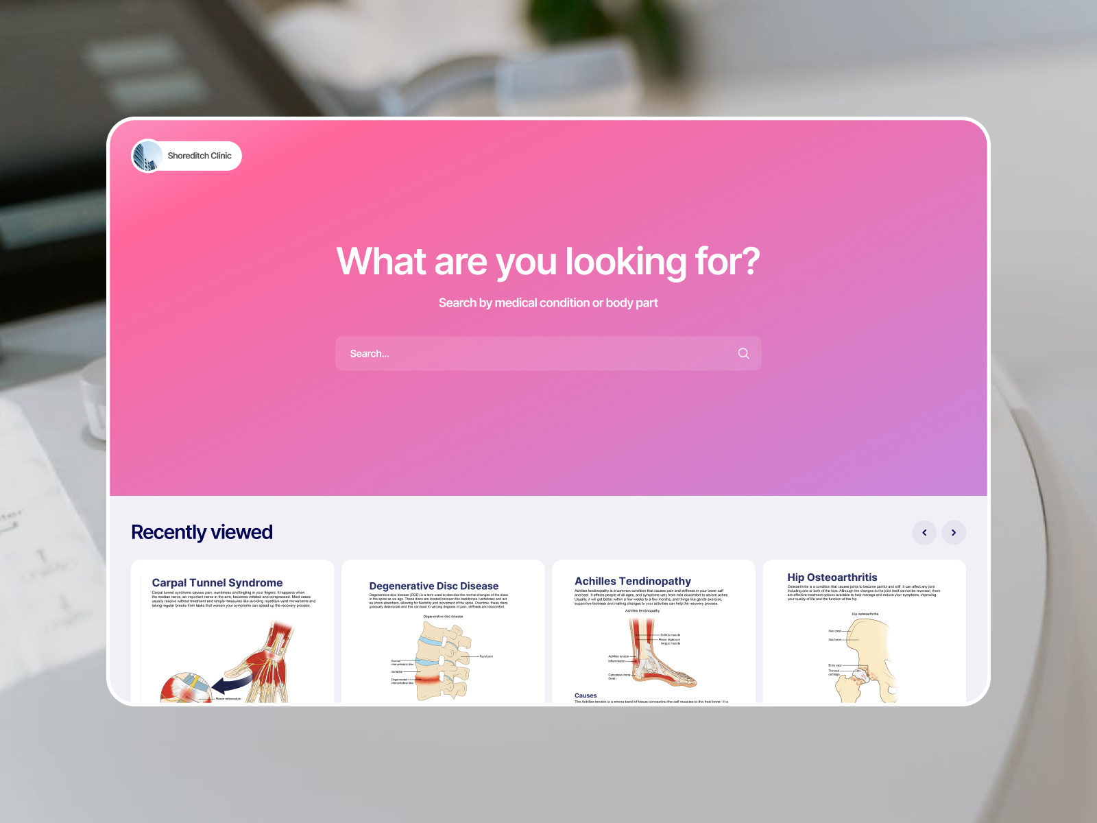
Information Architecture: Using site maps and wireframes, we meticulously planned the website’s architecture to ensure it was logical and conducive to quick information retrieval across all device types.
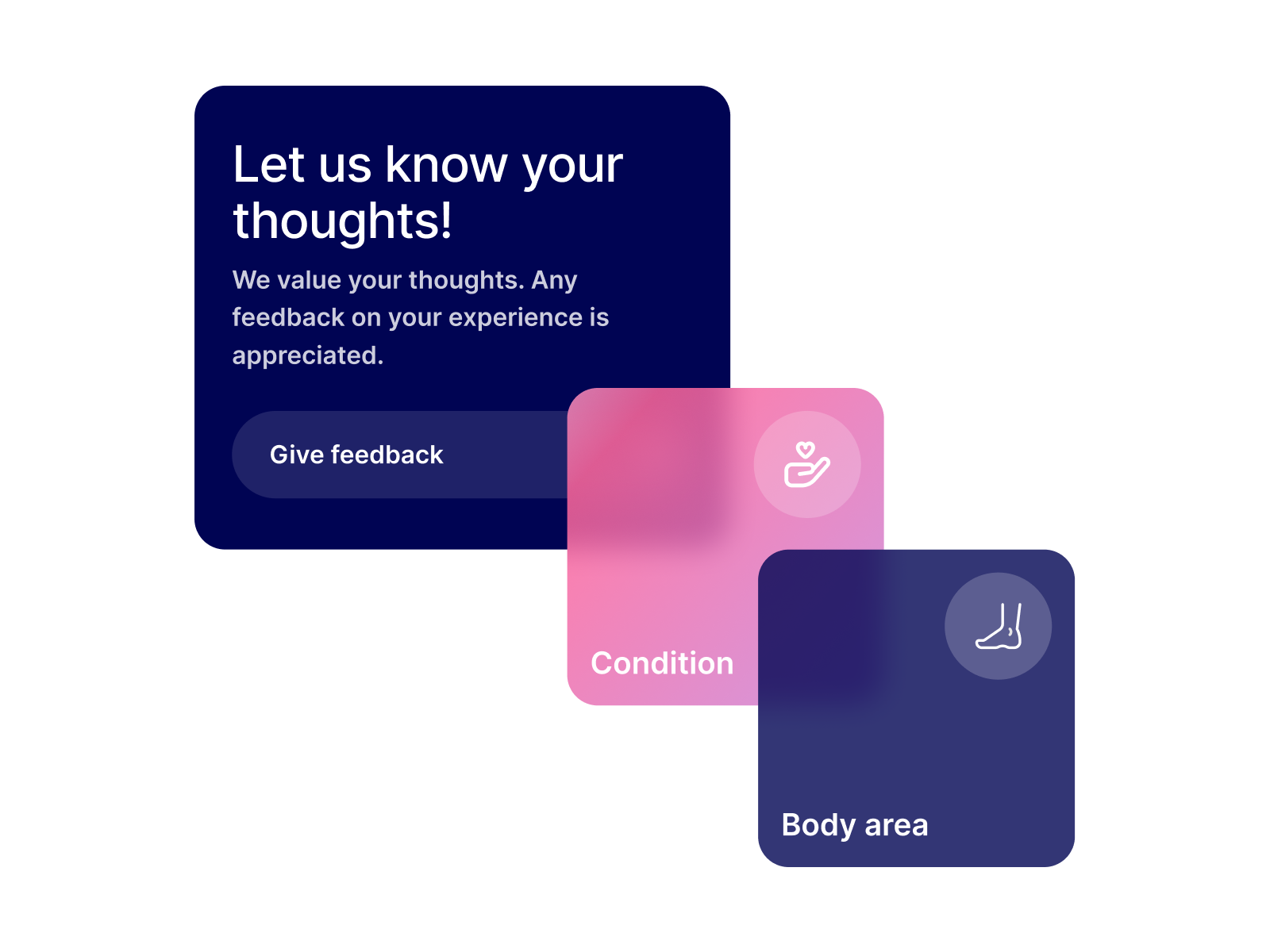
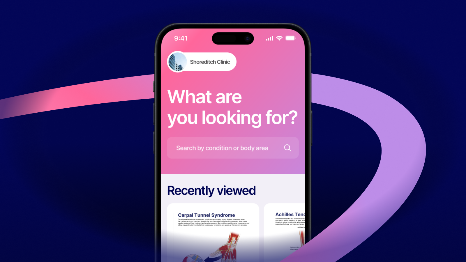
User Interface Design: The interface was designed to be visually appealing and easy to use. We focused on creating a clean layout with clear navigation cues and interactive elements that enhanced user engagement without overwhelming them.
2. BRANDING REFRESH:
Workshops and Sketches: Iterative branding workshops and sketching sessions were conducted to pinpoint a unique aesthetic that communicated Cetra’s innovative approach. These sessions were instrumental in refining the visual language and ensuring it aligned with the strategic goals of the project.
Visual Identity: The new branding was bold and modern, utilising a color palette that stood out from typical medical apps to emphasize innovation and clarity. The minimalist design helped in reducing visual clutter, making the app and website feel more inviting and less intimidating.
Client Feedback
They noted that despite the tight deadline, our deliverables exceeded expectations, providing a cohesive, stylish, and user-friendly platform. The client was particularly impressed with how the team managed to integrate complex medical content into a streamlined, accessible format.
Outcome
The final product was a vibrant, sleek interface that combined aesthetic pleasure with functional design, making it both visually beautiful and a joy to use. The app and website have transformed how medical documents are managed and shared, enhancing user satisfaction and operational efficiency.
Future Directions
Encouraged by the success of this project, we are exploring further enhancements, including advanced data analytics features for medical research and the integration of AI to personalise user interactions, aiming to further revolutionise the medical documentation landscape.
Conclusion
This project highlighted the importance of understanding user needs and the specific challenges of the medical industry when designing digital tools. The successful redesign and rebranding of Cetra not only improved the functionality but also enhanced the overall user experience, setting a new standard in the medical document sharing space.

